Design
Cereal Box Design Tips to Stand Out on the Retail Shelf
On a crowded cereal aisle you have about three seconds to earn attention. Here is how packaging design wins the impulse buy.
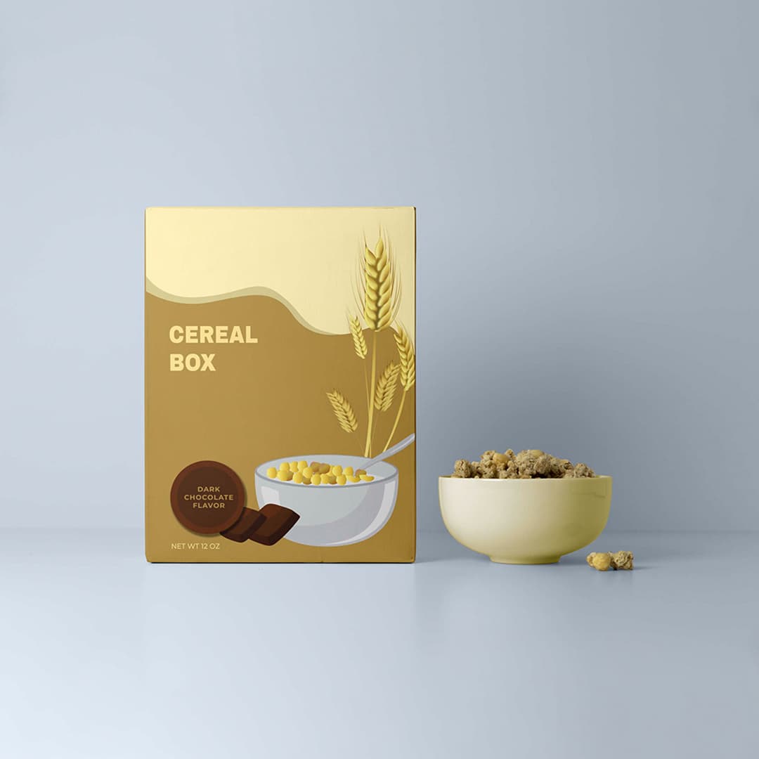
The cereal aisle is one of the most visually competitive shelves in any grocery store. Dozens of brands, all bright, all shouting. A shopper scanning that shelf decides in a few seconds what to even pick up. Good packaging design is what earns that first look and then closes the sale.
Win the first three seconds
Shelf impact is about one thing: being seen from a distance before the shopper is close enough to read anything. A single bold focal point, strong contrast, and a clear brand block do more than a busy layout crammed with claims. Decide what the one thing a shopper should notice from two metres away is, and build the front panel around it. A well-printed panel on custom printed cereal boxes is what turns that idea into shelf presence.
Use colour and branding with intent
Colour is the fastest signal on a shelf, and it carries meaning: warm tones read as indulgent and fun, greens and earth tones read as healthy and natural. Pick a palette that matches the product promise and own it consistently across the range so shoppers recognise your line instantly.
- Anchor the range with one signature brand colour shoppers learn to spot.
- Keep the logo and key claim in a consistent position across every box.
- Bright, saturated print on colourful cereal boxes suits fun and kids' ranges.
Let structure and finish do the closing
Once a shopper picks the box up, structure and finish decide how premium it feels in hand. Matte lamination reads as considered and natural; gloss maximises colour pop for playful brands; spot UV on the logo adds a subtle premium cue. The right combination depends on the product's position and price — the same trade-offs we cover in our guide to choosing the right cereal box packaging.
FAQ
Common follow-up questions
The front panel's shelf impact from a distance. A single clear focal point, strong colour contrast, and a consistent brand block earn the first look; everything else supports the sale once the shopper is closer.
It depends on positioning. Gloss maximises colour vibrancy and suits fun, kids', and value ranges; matte reads as more premium and natural and suits health-focused or artisan brands. Spot UV on a matte base is a popular premium compromise.
In This Article
Related Pages
Need Packaging Help?
Start your custom cereal box project today
Use the quote page to share your packaging specs and get a custom quote within 24 hours.